Archives for category: pattern

giftwrap3variationMy pattern “summer nights” was shortlisted (again) for the recent Tigerprint giftwrap Make Your Mark competition – from over 960 entries 71 designs were chosen, here is the shortlist. If this pattern looks familiar to you, you’re right, it was already part of my Pattern 16/52 giftwrap collection. But I really wanted to share the Tigerprint news with you and truth be told I have no new pattern this week – all my design skills were needed for my big, shiny and new online project. To be revealed next week!

Cathrin Gressieker- Summer Nights

This week’s pattern was created to a brief in week 2 of the ABSPD course Module 3 (The Art and Business of Surface Pattern Design). The assignment was to design a tea towel using traditional media and only black, white and two other colours of choice.

I really wanted to recycle the textures I made last week as they were already black and white. Also I have enjoyed paper cutouts recently and got myself some coloured paper at the art store. So here it is:

Cathrin-Gressieker-_teatowelmidcenturymodernburnI glued everything to a 50 x 70 cm canvas and once it was dry I thought: This would actually also fit into my upcoming exhibition alongside with this painting and this collage. I really love it, when surface pattern design and “art” come together. And you know what, I also used the tea towel design for another e-course. Yes, e-course-addict (me) has started a new course this week: radiant heART. But how could I resist a painting/photography course with the amazing Alena Hennessy and Susan Tuttle? See, I just couldn’t. In this course the first exercise was to make an “I-am-collage” with a painterly background and write on them (digitally) all the wonderful qualities that make you who you are. That’s me:

Cathrin Gressieker_I-am-collage

As you might have noticed by now, I am quite addicted to online art courses. Addicted is probably not the right word – e-courses are just such a gift of modern technology. You can learn from top artists and teachers, be part of a supportive worldwide online community and have some schedule and assignments to keep you motivated and for structuring your creative time.

This week Module 3 of ABSPD (The Art and Business of Surface Pattern Design) started. I took Module 1 in October last year and Module 3 in January and I can see and feel how my designs have evolved and how much I have learned all along the surface pattern way.

This is another 5-week-intensive course and there is only one problem for me now – making time for art and designing. I am teaching more yoga classes at the moment and then there is the usual family bustle. So it’s all about finding small windows of time. We were given an assigment for designing 6 patterns for a giftwrap – non floral and non organic, please! Everything else was possible, geometric, ornate, abstract, textural. For late 30’s affluent female customers (would that be me?).

I went for textural and made some textures with black acrylic paint in my studio.

DSC06803-kThe finished giftwrap collection came together in Photoshop and Illustrator (in the wee hours of Saturday morning). I wanted to keep it loose, free and playful.

Cathrin Gressieker giftwrap collectionThese are all placement prints, but could be made into repeating patterns easily. I am warmed up now for the coming weeks of pattern designing.

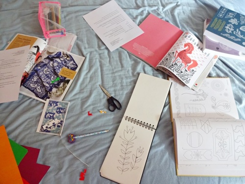
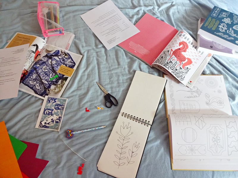
This week’s pattern is again a by-product of the Make Art that Sells course Part B, its 5th and final week was dedicated to Party Paper – paper plates, napkins, paper cups, wrapping paper etc. Our inspiration – the mini – was Bavarian and Ukrainian folk art. Ok, I am half-German (but not Bavarian) and half-Russian (but not Ukrainian), so this had something of a homey feel. But – I wasn’t at home at all, we were on our family trip in Amsterdam during most of the week. The good thing is, inspiration is everywhere. And the mini warm-up exercise gave me some kind of tunnel vision in the back of my head (if that’s the right term) for our time in easy-going Amsterdam. You can see my inspiration from what I brought home from Amsterdam. The latest Dutch edition of Flow magazine had a great folksy illustration by Uzbekistan-born Dinara Mirtalipova in it and I remembered having seen her work in the German Flow magazine as well. Folk art is a lot about flowers and birds and the idea for the birds came flying to me while seeing the Matisse exhibition with this paper cutouts. Let’s try a Matisse-inspired folk art thing! I took some coloured paper with me from the children’s corner as I wanted to bring some original Amsterdam flavour home, plus a limited colour palette can be such a liberation also. My mind was set.

Back at home I started the manifestation.

Cathrin Gressieker DSC06585-k

Cathrin Gressieker DSC06587-k

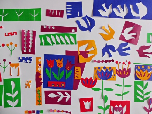
All my cutouts. And then I started glueing. A bit scary, so final. Here is the paper plate.

Cathrin Gressieker DSC06592-k

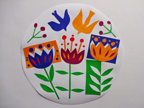
Over the course of the first day back at home I glued together this plate, a napkin and a cup. And then I scanned them all in and brought them into Photoshop for final tweaks and presentation.

Cathrin Gressieker_Matisse in Amsterdam_4B_WK5

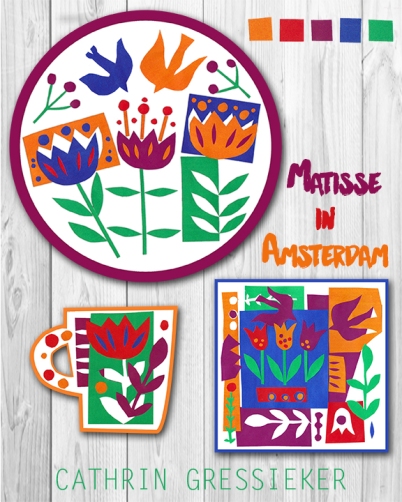
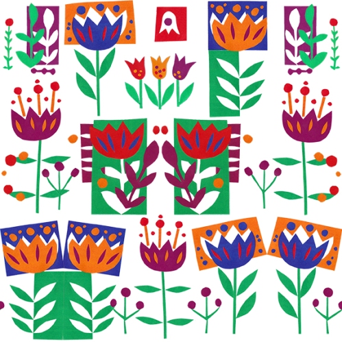
As the “fairy art mother” of the MATS courses Lilla Rogers says, you can reuse the art and icons for one market for other markets. And I did that for another upcoming Spoonflower contest “Flowers for Mom Border Print” – a floral border print design for Mother’s Day. Here – at last, if you made it that far – comes my pattern of the week “Amsterdam in April”:

Cathrin Gressieker _Amsterdam in April _floral border pattern

And tested on an apron template (the template comes from Jenna Frye’s Skillshare class “Introduction to Surface Design: Creating And Mixing Patterns”, that you could watch for free this week):

Cathrin-Gressieker-apron-amsterdam-in-april
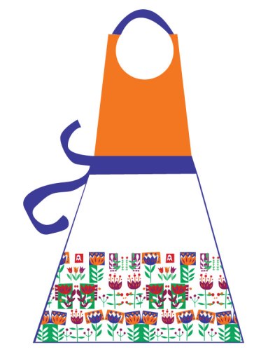
Looks pretty Dutch, doesn’t it?

 You can enter the contest until Tuesday, April 28th. Voting will open on Thursday, April 30th.

The pattern of the week is the result of the work I did in Week 3 of the MATS B course. The market was scrapbooking – something that took me a while to grasp. There is no such market in Germany (yet), but we were provided with lots of information and visuals in the class to get an understanding of it. The other thing was the topic – airships, also known under the funny names of dirigibles and blimps. This also took a while for me to get going – or in the creative language – get sketching. Drawing technical details with my regular pens wasn’t too much fun for me. When we got the assignment, to make a vintage-correspondence-themed scrapbooking page incorporating airships, I had an idea – old-school pen & ink. Lilla Rogers always encourages to try new things in our art and I hadn’t drawn with a real nib since my school days.

DSC06505-k-Cathrin Gressieker And then there was no stopping me. This was the week I put the most time into an assignment. It was Friday and the deadline was Sunday evening and I was about to go to an ashram to teach a weekend prenatal yoga immersion. I worked on the train and in-between my yoga classes and instead of attending collective yoga ashram chanting.

Cathrin Gressieker_Screenshot (34)-k

I wanted to give my piece a watercolour feel and used digital watercolour swatches from Nicky Latz for it.

Cathrin Gressieker-Screenshot (37)-k

My laptop had quite a hard time saving all those bits, but in the end I had a final page:

Cathrin-Gressieker-high-times

One more good thing after all this (pleasurable) work – Spoonflower had an upcoming contest “Flying machines” and I could reuse my icons to assemble a repeating pattern:

Cathrin-Gressieker-high-times-patternIf you like my pattern, you can vote for it and as many others that you like here.

giftbox flying machines

Thank you!

Stoff’n is a German company similar to Spoonflower – I did my first printed pattern design with them and was really happy with the quality. They are not as big as Spoonflower, but they also do pattern contests, on a monthly basis. “Faith” is the theme of the current contest and it took me some time to come up with an idea for this. But you know, as a yoga teacher, I went into that direction with prayer beads called malas.

Cathrin Gressieker - Om Yoga Perlen-kThe colours inside the malas come from paintings of mine (you know, still enjoying my new favourite Photoshop trick of filling a shape with a pattern with just one click). The purple backgrounds makes the malas pop and is also the colour associated with the highest chakra, the crown chakra – your bridge to the cosmos, your spiritual connection and through it you can reach your higher potential.

What about some yoga props?

Cathrin-Gressieker---om-yoga-beads-collection-mock-upIf you like my design, I would be honoured if you voted for me. Alas, the voting process is not as easy as Spoonflower’s, you have to be signed up with Stoff’n for it – here is the link to the contest gallery. Om Om Om.

My pattern of the week comes from week 2 of the Make Art that Sells course, where Baby Apparel was the featured market. The warm-up drawing exercise was “seahorses”. I must say, I have always loved seahorses since I was little. Did you know that seahorses are the only known species in the world where the male has the babies? That could make a cool daddy & me baby T-shirt, but who would get the meaning? So this was not such a good concept. Another thing about seahorses that I found out is, that they do a very beautiful mating dance, for hours and days (you can see a video here). So I went with the love thing (didn’t I also do “love” for last week’s assignment, but you know, LOVE is my word for 2015). So the main assignment was to create patterns for baby apparel using our seahorse sketches.

Cathrin Gressieker_Seahorse Love_4B_WK2I designed a main pattern, coordinates and also did some onesie mock-ups. Not bad for one week. There are so many talented people in this course and you can learn so much just by seeing their work (and doing your own, of course!). More LOVE next week!

Yes, spring is here! At last! Sunshine, birds and flowers! And you know what the assignment for the first week of MATS B was – to design a winter holiday card … featuring toy trains … That’s business, I guess, you never know what you are assigned to do and then you start working to work up a mood, a Christmas mood for instance. As my illustration skills are still about to be developed and I am not such a fan of cutesie motifs like animals and quirky characters, my Christmas card turned out quite minimal and toned-down:

CATHRIN GRESSIEKER_LOVE EXPRESS_4B_WK1I used gelli prints from last November, when I really was in a pre-Christmas mood (blogged here) and put the card together in Photoshop using a new favourite trick of mine – filling a shape with a pattern with just one click (58 seconds youtube tutorial here). The ultimate question for the card is – would I send it to friend? I would.

This card was created for the paper market, obviously, and I mocked it up on a placemat to see how this would look like:

Cathrin-Gressieker-xmas-placemat

And now, back to spring, and thanks Lilla Rogers!, the next assignment is something cute for summer. More about that next week.

Exciting news! This pattern of mine is shortlisted for the Tigerprint Floral Pattern Competion.

Cathrin Gressieker-textured tulipsyou can see the whole shortlist here

I created this pattern this month during the Art and Business of Surface Pattern Design course Module 2. We were given a lot of trend reports for spring and summer 2016 and I used some of the colours that were forecasted by WGSN. The tulips were hand-drawn. Hubby has this new thing about having fresh flowers of the windowsill of his room. A vase full of tulips and a longing for spring to begin served as my model and inspiration. The pattern is then naturally named after its flower-lover – “Oliver’s Tulips”.

Scan_20150204-crop-k

From over 1400 entries Tigerprint has chosen 87 pattern for the shortlist, so I am happy and amazed to be on that list. And as is this surface pattern design class is so talented, there are a couple of other classmates shortlisted. Congratulations to all of us! Everybody could submit up to five designs and I must say that this was my least favourite … but who knows, what the Tigerprint people are looking for. The shortlist is such a mix of so many different styles, it will be a real surprise to see the winner. As my pattern is very spring-seasonal and “edgy” I am not for a second considering being picked for the floral crown. But no matter what, I enjoyed making this pattern a lot and especially learning how to apply textures in Illustrator. Good luck to the other ABSPDers!

This week’s pattern I designed for a Spoonflower design challenge called “coral, mint, black and white”.

6a00e5523f5f4d883401b8d0c61390970c

And these are exactly the colours you are supposed to work with, and only these colours. Not the usual palette I am drawn to, but a very refreshing inspiration, I found. For my pattern I used one basic hand-drawn shape of a bud.

spoonflower coral mint black whiteLet’s call the pattern “sophisticated buds”.

This is how it looks like as a bedding mock-up:

spoonflower-coral-mint-black-white-bedding-mock-up

It is the first time I enter a Spoonflower contest, so I decided to brush up my Spoonflower page and add some more designs. You can see it here, if you like. Voting for this design contest starts on Thursday, March 5th. You can still submit until March 3rd. Good luck everyone!